|
I was just looking at the Rosemary & Co Facebook page and found a link to this video on brush maintenance - which I thought I'd share on here.
0 Comments
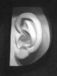 I recently completed this cast drawing, my second since starting full time at LARA. The drawing is done in Nitram charcoal on Fabriano Roma paper. The subject posed some interesting problems. Not only was it a challenge to get the internal information correctly laid out - the outside of the cast itself also had peculiarly difficult dimensions to capture.
The exercise of producing the drawing was made easier by conceptualising and naming the different abstract shapes that make the the overall impression (I managed to find a cat, a swan, a scimitar, a fish and a kiwi). This really helped in understanding the gesture of the individual folds of the ear, enabling me to arrange the various masses accurately. Getting the correct values was the second big challenge. It is relatively easy to get two adjacent values in the correct relationship, but much more difficult to juggle the whole light impression so that the drawing accurately matches nature. In this instance, along with the smaller planes there were two distinct larger planes of the ear (the upper part tipping towards the viewer from the top to the middle, the lower part tipping away from the middle to the bottom). This took quite a while to get right. Overall I'm really pleased with the drawing - particularly the handling of the shapes. The finish is not quite as refined as I'd like, though - and the drawing doesn't seem to 'pop' out of the page to the extent I was hoping for. Something to aim for in my next one, which I kicked off a couple of days ago. 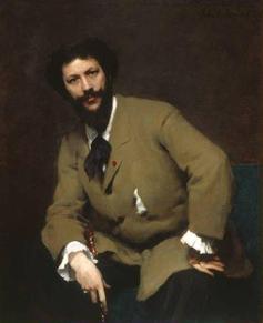 Born in 1847, painter and art critic Robert Alan Mowbray Stevenson (a cousin of Robert Louis Stevenson) In 1873 Stevenson studied at the Ecole des Beaux-Arts then under Carolus Duran (pictured left). He wrote the classic book Velasquez in which he discussed the nature of the purely pictorial appeal of the painter's art. The final chapter of the book, in particular, has some fascinating insights into the philosophy of seeing which is at the core of much modern representational painting.
These excerpts give an indication of Stevenson's conception of the importance of the visual impression in Velasquez's work - his views having been informed during his time studying with Duran: "The modern painter should concern himself very much about what seems and scarcely at all about what is." "Twigs, stones, slates, grass, leaves, can only be suggested; an attempt to define them really could result in nothing but a coarse travesty, which must inevitably lessen the effect of the more important markings." "Those who have not been taught from the beginning in an impressionistic school must remember difficulties which beset them when they were working from nature, and will recall how they only began to appreciate the meaning and the necessity of working from a single impression. How often it seemed impossible to finish a picture. The more closely they applied themselves to study and complete a part, the more it seemed to change to their eyes, and to invalidate their previous observations... Now, all of his separate observations may have been true, but they were all made under different conditions of attention to the scene; whereas, until every part of the picture has been observed in subservience to the impression of the whole, completeness can never be even begun." "A shadow on the yellow sand will alternately seem cold or warm, blue or orange, according to the concentration or diffusion of the sight...When a shadow is looked at alone it appears more full of colours than when the surrounding sunlit parts of the view are taken in and are allowed to operate on the shadow."  A few days away from the easel have given me the chance to reflect on what I've learnt in recent weeks and to think about a direction of travel for the future.
At such an early stage in my training it feels conceited, in the extreme, to bring to mind the panoply of great art and distinguish between art I'd like to emulate and art that I wouldn't. To get within 500 miles of any of these masterpieces would be achievement enough, so why be choosy? The answer, I suppose, is that "the greater danger for most of us lies not in setting our aim too high and falling short; but in setting our aim too low, and achieving our mark." This was supposedly Michelangelo's view and it really would be conceited to argue with that! Even a beginner needs to know what direction to go in. So, for what it's worth, here's my attempt at putting it into words. The works I admire above all are more than simply ingenious. They demonstrate an approach that is decisive and direct, rather than being laborious or mannered. I am also not interested in works that simply aim to shock - that shout too loudly for your attention, but rather ones which speak softly, engage and grow on you and win your love. I also dislike subject matter that is maudlin, sappy, overemotional or heavily self-concerned. I prefer work that is outward-looking, intelligent and fresh - that takes the viewer seriously and respects their capacity to make an intellectual as well as an aesthetic effort. Separately, I feel paintings should tell us something about ourselves and the world and are more effective when they are articulated with the past. Great paintings encourage fascination and wonder and, like good writing, have a subtlety - tending to "show" rather than "tell" their story. From a stylistic perspective, paintings with confident brushwork and a unified but refined effect captivate and move me the most. It is here, I feel, that one sees the rare combination of technical virtuosity which still manages to remain lively, sensuous and tactile. This, I think, has something to do with economy of effort - a sort of studied carelessness (sprezzatura). John Collier in A Manual of Oil Painting made a similar point, but 'packaged' for the art student: "There is too much to learn in painting for any man to allow himself to dawdle over it - so he should never do in ten minutes what he can do equally well in five. Of course it must also be recollected that he should never do in five minutes what he can do better in ten". So, how do you get there? I honestly don't have the faintest idea - but at least it's a direction. I guess the prerequisites are to be self-critical, diligent, energetic and humble - and not to cling desperately to comfortable formulae. With the aim in mind maybe the journey won't involve too much wasted effort trudging down the wrong tracks.  Over the last few years I've had my fair share of ill-advised purchases from art supplies stores. There are some fantastic products out there but for other items you really are better off (in terms of functionality and finances) making them yourself. Here's a selection of my most successful art hacks:
Palette cups: there are several major problems with the palette cups generally sold by art suppliers. First, they're always teeny, secondly, they get so gunked up with medium so quickly that it's hardly worth spending money on them and thirdly the clip on the bottom is always too small to clip to anything other than the flimsiest of palettes. Solution: find a catering wholesaler online. Buy a small steel sugar bowl (the kind you get in cheap cafes - get half a dozen if you want to make a few) and some sprung table cloth clips (this should come in at less than £5). Glue a clip to the underside of the bowl using a strong super glue and voila! Mahl sticks: there are some very expensive and fancy versions available online but a 3 ft piece of half-inch dowel works just as well. If you're worried about damaging your painting surface you can pad the end by getting some fabric (gauze bandage works well) - taping and/or stapling the end of it about an inch below the end of the dowel. Wind the bandage repeatedly round and over the end of the dowel to make a padded end. Secure with tape and/or staples. Cover the entire thing with a circle of chamois, held tightly in place with a thin cable-tie fastened around the dowel where the padding stops. Taboret: the top-end art suppliers charge a fortune for taborets (a.k.a. artist's trollies). I've been tempted in the past with getting one of them but places such as Ikea, Robert Dyas and the Range do kitchen trollies at a fraction of the price which work just as well. Black mirror: lots of ateliers recommend students use a black mirror to judge shapes and values. The black mirror is a derivitive of the 'Claude Glass', a small mirror, slightly convex in shape, with its surface tinted a dark colour. They were used by artists, travellers and connoisseurs of landscapes and had the effect of reducing the colour and tonal range of scenes and giving them a painterly quality. The trouble is it's difficult to find them for sale. A simple solution is to get a cheap A6 size clip-frame and a can of matte black spray paint. Remove the glass from the clip-frame and spray one side of it. Allow to dry. Replace the glass, paint side down and clip in place against the back-board to protect it from bumps and drops. Sanding blocks: the sanding blocks sold by art suppliers are usually expensive and really poorly made (just a few bits of cheap sandpaper stapled to a strip of board. As an alternative, you can get foot files from online health stores for a fraction of the price which are much stronger, last far longer and normally have two grades of surface, which can come in handy. Picture frames: not such a new idea - artists have been doing this for years, but worth sharing anyway for those who have not cottoned on. By far the best way of protecting your pictures is to get them framed. However, if you have studies and drawings you want to protect which don't justify bespoke framing, you can pick up good quality frames in charity shops. Most people look at the picture inside the frame when they price up these articles. Since the pictures inside are normally hideous (!) you can get some absolute bargains if it's just the frame you're interested in. Remove the offending picture (usually this will be of a log cabin by a waterfall, a child hugging a dog or a WWII fighter plane), clean the glass, dust the frame, cut a new mount if necessary, and fix the picture inside with the original board or a new one - held in place with glazier points (available - with the tool to push them in - from most hardware stores). Well, that's my selection so far. If I come across (or invent) any others I may do a follow-up post on here. If you have any art hacks you'd like to share then do let me know! 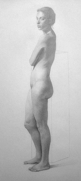 We've reached half-term at LARA and also the end of the first four-week pose of the school year. I'm fairly pleased with the result, which has a good finish and a better sense of gesture than my previous two-week drawing.
I've been reflecting on what I've learnt from the drawing in order to decide what to focus on in the next one. There are several aspects I'd like to improve. Beginning at the beginning, I committed to the block-in rather too soon, moving on to the more advanced stages without spending enough time chasing the shapes. It's good to keep the lines of the block-in straight, light and sketchy, since the outline and shadow line will inevitably need many revisions as the drawing progresses. It's a question of balance really. The idea is to be as accurate as possible but not allow the lines to get too nailed down too early. In my case, after devoting a long time to a rather too refined outline, I found inaccuracies later on that I was reluctant to acknowledge and grapple with. In particular, I found the shape of the skull was badly observed and the length of the arm and abdomen were out of proportion. Separately, the entire pelvic region and length of the legs needed several revisions. The portrait was my biggest problem. After a promising start, I eventually recognised that the location of the eyes was wrong. I initially nudged the eyes around, shaving off a bit here and adding a bit there, but this wasn't working. Before I really knew what was happening I'd entirely erased the eyes. The nose was the next victim and then the mouth and suddenly I had nothing left to work with. By this stage the paper was becoming marred and scruffy and the only thing I could think to do was grab a separate piece of paper, attach it beside my drawing and do a fresh portrait study. That really helped and eventually I managed to get the head back, with an approximate likeness. The later stages of the drawing were much more enjoyable. I experimented with lots of techniques to capture the correct shapes and values: liberal use of the black mirror, flicking the eyes back and forth to identify drawing errors (which appear to the eye by a sort of ''jump" in the form), squinting down to find value families and transitions. Though it may sound a bit mad, it is particularly helpful (and fun) to find and name abstract shapes in the figure, either looking directly at the model or through the mirror. After a while I was seeing shapes everywhere: a bird shape in the scapular, a dinosaur head in the ankle, an elephant head in the pelvis and so on. For some reason, giving a name to the shape makes it so much easier to be specific in describing that shape in line and value. The last couple of days were spent working on the rendering. The result is a highly polished drawing with a pleasing sense of luminosity and texture, but one which does not have the breadth that I really want to aim for. To me, the most pleasing art has an economy of expression - revealing the maximum amount of information with the minimum of visual detail. That, above all, is what I'd like to work towards in the next and subsequent figure drawings. I've never been a big sketcher. The received wisdom from most art educators is that sketching is a good habit to acquire, but it's just not one I've managed to pick up. I've always been the kind of artist who likes to work slowly and methodically and the idea of whipping out a pencil and a pad and scribbling away at the bus stop just never stuck. However, there are lots of reasons why I'd like to change that.
To begin with, I've been using the sight-size technique for quite a while now and while it's a fantastic approach for training the eye, it can make the student somewhat mechanical in finding proportions. Thinking particularly about figure work, it can lead to somewhat rigid drawings which lack a sensitivity to gesture. There are also situations where it is simply not practical for the artist to work sight-size. Additionally, the rather looser handling that sketching requires is most likely good training for me - particularly as I'm one of those people who frets and fusses over the very early elements of blocking in a drawing. It's not necessarily a bad thing to be careful at this early stage (quite the contrary in some senses - 'begin slowly so you can end quickly' as the adage says) but I often feel I devote so much time to the construct that I become unwilling to make changes later when they become more visible. I waste time on, for example, minute nuances of contour, which are better left for later in the process. I think that's a weakness I need to target and sketching seems to me a good way of doing that. Separately, sketching is a great way of exploring ideas, subject matters and compositional arrangements during the beginning stage of a new project. Like everything in art, though it requires the grasp of a few basics and plenty of practice. The difficulty I'm having is working out a process for doing sketches. I'm going to LARA's excellent Wednesday evening quick sketch group, a series of 5 and 10 minute figure poses, followed by a 45 minute one at the end. The sketch group has been really beneficial in developing a working method. I'm not quite there yet. Currently I'm adopting a mixture of approaches. I've watched the online videos on gesture drawing from Stan Prokopenko (see under Resources) and I try to utilise some of the suggestions shown there. Drawing Tutorials Online is also worth a look. I particularly like the methodology explained in Burne Hogarth's Dynamic Figure Drawing - as it gives a straightforward logical approach to finding the major masses of the body and expressing gesture and depth. My sketches are getting better, slowly - and I can really see how a quick and lively series of sketches can help inform and invigorate longer term figurative projects. Do you have any favourite resources or words of wisdom on the art of sketching? If so, drop me a line via 'Comments'. |
Ben Laughton SmithContemporary works of art in the classical tradition. Archives
March 2021
Categories |
 RSS Feed