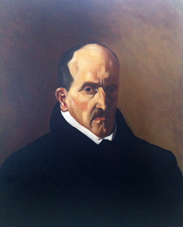
 Here's the latest piece to come off the easel. It is a copy of a portrait by Diego Velasquez. I haven't quite captured the essence of the original but I'm still very pleased with the results. This is the first master portrait copy I've done and it was an enjoyable exercise in studying Velasquez's technique. I did the copy from a poster which I ordered online. Having set up the poster, I firstly did a fairly quick sight-size charcoal drawing - just the outline, shadow line and key features. I then transferred that to a neutral toned canvas. I lifted out some of the lights with a rag dipped in a little turps and darkened the shadows, keeping the paint turpsy and limiting my palette to just black and raw umber.
I had some difficulty in getting the proportions of the head correct. Visually it seemed to be too wide and squat but when I measured from the original my copy was actually coming up longer and narrower. It took quite a bit of adjusting before I was happy with it. Having got the basic shapes reasonably resolved I then started building up layers of colour with increasingly oil rich medium. The palette was originally just lead white, yellow ochre, light red, raw umber and ivory black. Towards the end I was having difficulty getting a sufficiently pink tone for the lips and ears, so I added some English red. I toyed with trying Vermillion instead but the English red was the right call. The image I was copying from seemed somewhat yellow, which I imagine is due to the age of the original and the yellowing of the varnish. I did not want to reproduce that to too great a degree, but I did go over the final painting with a light stumble of yellow ochre. Overall a very useful learning experience and, I feel, a successful painting, even if I haven't quite captured the precise characteristics of the original.
1 Comment
|
Ben Laughton SmithContemporary works of art in the classical tradition. Archives
March 2021
Categories |
 RSS Feed