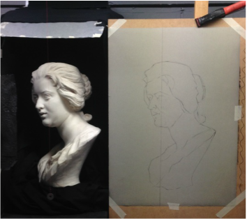
 This photograph shows my latest project. It is a cast drawing of the bust of Constanza Bonarelli by Bernini. I am completing the drawing in chalk and charcoal on toned Roma paper. I find the cast appealing because it is such a personal portrait, capturing the grace and elegance of the subject. The cast has a range of interesting textures which, I am sure, will provide me with hours of fun!
Constanza was the wife of Matteo Bonarelli, who was one of Bernini's pupils. Bernini fell passionately in love with her. The affair lead the normally good natured Bernini to fall out badly with his former pupil, eventually leading to the intervention of the Pope in order to sort the situation out before things turned really ugly between them!
0 Comments
 This cast drawing of Aurora, originally by Michelangelo was completed over several weeks in Autumn 2015 in chalk and charcoal on grey Fabriano Roma paper. The cast presented a number of challenges, foremost among them being to convey the backwards tilt of the cast. Creating the foreshortened effect required careful use of value in order to keep the focus on the near part of the face (the nose and mouth).
The face itself is highly idealised and smooth - but I managed to create interest by capturing some of the subtle textures of the paster around the jaw and within the headdress. 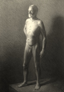 This was such an enjoyable figure drawing to work on. Luckily I got off to a flying start with a good solid block-in. I put a lot of effort into breaking down the figure into the major planes, which, although the drawing looked somewhat like a robo-guy for a time - enabled me to establish the overall proportions pretty accurately from the very beginning.
I wanted to produce a full value drawing and so I also devoted a decent amount of time to getting a background in that 'worked'. I used this to inform the values within the interior of the figure. It's come out well, compositionally - although it is perhaps a tad more dramatic than I originally envisaged. After the background, the main challenges were to ensure there was a nice solid feel to the standing leg and creating an interesting pattern of light in the upper torso. I had great fun trying to convey the somewhat less elastic skin type of an older model, which I think I've achieved with reasonable success. As so often happens, the gesture of the figure seems to have straightened up a bit over time. That is normally a product both of the artist making corrections which undermine a strong gesture and the model reducing the amount of strain in the stance over the course of the pose. Something to be mindful of in future. 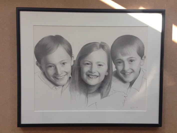 This is a recently completed pencil drawing of three young friends of mine, Charlie, Philippa and William, produced in pencil. Since it is really too arduous for little folks to sit still for long periods, I worked on this piece from a photographic reference. The final piece is nicely composed and was very enjoyable to work on.
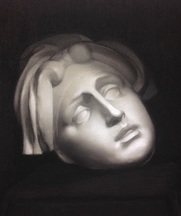
When picking photographs for artists to work from, there are a number of considerations to keep in mind. The most important thing is to ensure they are of a high resolution. In other words they need to show enough detail and not be blurry. A good test is to check whether it is possible to see individual eyelashes on the subject. The second factor is to make sure there is a nice balance of light and shade. Ideally the light should fall from above and slightly to one side of the subject. In my picture the light falls from the top right which has given a good strong shadow to the left hand parts of the three subjects. Natural light is usually best, especially if the picture can be taken on a slightly overcast day. However, strong, direct sunlight can give a bit too much of a sharp contrast and can tend to bleach out the colours in the light areas. It's important to bear in mind that what makes a pleasant photograph does not always make the best reference for a successful portrait commission, since the requirements of an artist are different from those of a photographer. The next thing to consider is the composition. It often a nice effect to have the photograph taken from slightly below the subject, or to have a "three-quarter" view with the shadowed part away from the viewer. Another possibility is to have the subject looking slightly over their shoulder. A direct gaze, such as I have worked with above, engages the viewer, but a slightly averted look also works and can suggest a more contemplative mood. On this occasion the subjects are smiling broadly but this isn't essential at all. A hint of a smile can contribute character though. A group painting like this makes a nice gift and can be more economical in terms of overall time taken to produce the piece and the framing costs. Individual pictures, though, are great in term of handing them down through future generations. The usual formats for portraits, whether in pencil, charcoal or oil, would be either "heads and shoulders" or simple head studies (either way at approximately life size). An individual pictures featuring a single head would be about 20x24 inches for a head study or 25x30 inches for head and shoulders. Half or full length pictures are possible but would require a lot more time as a result of the need to paint the clothing. If you are interested in commissioning a portrait in pencil, charcoal or oil, please take a look at the Commissions page of this site. 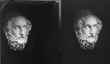 I'm currently working on a cast drawing of Homer. The image shows the cast, set up alongside my drawing. I have a few more days to go before it's finished.
The beard, of course, is ridiculously complicated. Tackling it required me to break down the area into major planes and masses of value, then sculpt out the bigger forms, before fitting in the smaller ones and overlaying the texture. It was a really difficult exercise to ensure that each of the shapes was both correct in itself and correctly related to all the other surrounding shapes. The trick in doing this is to begin from the middle and work outwards. If you try to do it the other way round, you end up with either a bigger or smaller space that you need right in the centre of the cast and you have to rearrange everything all over again. In my final few days I am intending to work on a few of the transitions, accents and reflected lights, tidy up the background and get a better overall light impression. Check back soon to see the final piece! 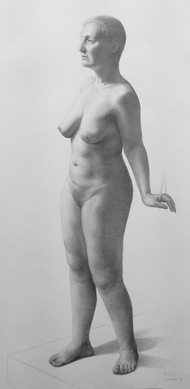 I completed this figure drawing over 40 hours in pencil. The shapes and proportions and the overall value scale worked well right from the beginning. However, I kept the drawing a little too geometric for a time, which I regretted.
The biggest challenge with this drawing, though, was the handling of the edges (transitions) between the light and dark passages. The secret is to make the edges generally softer rather than hard, but at the same time to keep them varied and specific. In a subject lit from a single source there will never be a single edge-quality throughout. For example, the lighting situation of this pose meant there were some fairly sharp transitions in the face and upper torso and more gradual transitions further down the figure. Even where the transitions are sharp there will, nearly always, still be a buffer area of gradated halftone in between the light and the dark. There were also a number of areas of subtle reflected light, dark ribbons of core shadow along the terminator line (between the halftones and the shadows) and passages of texture in the halftones themselves. Of all the elements of academic drawing, transitions are probably the hardest (and usually the last) element that the student has to learn. They're also very often the difference between an average drawing and one that packs a real punch. Something for me to focus on over the coming months.  I've been thinking lately about the main lessons I've learnt over the past year or so of my studies. There aren't any shortcuts to successful drawing but there are certain learning points which repetition and the making of mistakes have brought home to me. Here are my top ten tips for students of academic drawing. 1. The drawing comes first. Always, always, always. No matter what type of finish you're aiming for, whether loose or highly polished - the final piece will only ever be as strong as the accuracy of the shapes and proportions laid down in the early stages. Subtle and accurate values and transitions will not save a drawing that contains inaccurate placements of planes and masses. Get them right. 2. Be specific. The closest I've got to a magic formula is this: to make it look "just like it" you simply have to make it look just like it. Not much magic in that, sadly! It's remarkably easy to forget to check your shapes and to get lazy with your observations. Look at your subject: if there's something on it that isn't on your drawing then put it on your drawing. Conversely, look at your drawing: if there's something on it that doesn't belong there - take it out. Don't be satisfied with putting a patch of tone that's approximately the right value and shape with nearly the right edge-quality. Be deliberate and get it right. 3. Never leave an obvious error on your work. Ever. If you can see something that's wrong, fix it straight away. It will not get any easier to make adjustments the further on you go. 4. Modelling is a subtle business. In a three dimensional object under natural or artificial light, no one area of value will be the same as any other adjacent area. To make the object "turn" you need to take account of all of these subtle variations in value and keep them in the right relationship to one another. 5. Finish it properly - starting right now. It's all too tempting to recognise that there are weaknesses in a drawing but excuse this by saying you'll do it right on the next one. At some stage you're going to have to push a piece to the strongest finish you can manage. It won't be any easier to do that on your next drawing so you may as well make it this one. 6. Keep your tools sharp. Whenever you need a rest, get out your sharpening block. The overall finish of your piece depends upon keeping a fine point. Sharp tools will save hours of painstaking dot-picking later in the drawing. 7. Beware of simultaneous contrast. Simultaneous contrast is the tendency of a value to induce its opposite value upon an adjacent area and be mutually affected in return. Basically it looks like this:
8. Only the highlights will be just paper - every other area will require some degree of tone, however slight.
9. Keep your lines straight (or slightly convex) and look for angle breaks. Particularly in figure drawing, there are very few concave lines and even S-curves are best used sparingly. Lines tend to be shorter around the smaller, bony forms. 10. Use as many different viewing methods as you can. Anything you can do to simplify or conceptualise shapes, values and transitions is going to help. My armoury of viewing methods includes the clear and 'black' mirror, comparative measurements using a skewer or knitting needle, squinting and defocusing my eyes, isolating patches of value by looking through a 'tunnel' between my hands, flicking my eyes rapidly back and forth between the subject and the drawing so that errors jump out and searching for (and naming) specific shapes (this exercise is a bit like finding animals and faces in the clouds and it's really helpful). Of course, there are innumerable other lessons I've learnt (usually the hard way!) but these ten are probably the ones that have been hammered home the most. To this list I would actually add a number 11: Be absolutely honest with yourself. Are you really looking? Can you possibly do anything to make your drawing any more specific? Are you sure you're not just going a bit too easy on yourself?! Do you have any other pearls of wisdom that you always try to keep in mind? Drop me a line here and let me know - and I'll share the best. 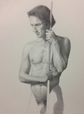 This pencil figure study was my first drawing of the summer term at LARA. Working on the block in, I tried to focus on using overlapping lines to establish the wedging of the anatomy.
Once I'd got the gesture and overall proportions in place, I decided to tackle the values by a different method from my usual approach. I decided to key the drawing by finding the darkest dark in the hair, and then move on to the arm and shoulder on the right, rendering it as fully as possible before moving onto the other areas. In effect this was an adaptation of the 'window-method' used in some schools. The drawing progressed quickly and I was encouraged in my efforts by having got the likeness of the portrait pretty close from an early point. Since this was a two-week, rather than a four-week, pose I decided to concentrate on the top half of the figure and bring that to as high a finish as possible, instead of attempting to do the entire body and risking not finishing any one area completely. 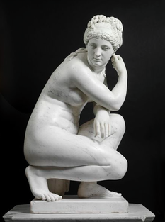 Studies at LARA finished for the Easter holidays a few weeks ago. After a few days R&R, I got down to some 'holiday homework'. A wickeder invention to bedevil children could hardly be imagined; the harbinger of drudgery and adventures postponed. Paradoxically, on returning from holidays you were expected to write at length about all the jolly capers you got up to. Presumably this was intended as an exercise in fiction, since most of the time was spent learning sodding French verbs. Anyway, for what it's worth, here's what I did during my holidays.
My first project was to take out my whizzy new Soltek plein air easel for a spin. I decided to go all Gray's Elegy and do a landscape featuring a country churchyard. Sadly, the two days I spent on this didn't result in anything very pleasing - so I've put that one down to experience and will try again when the weather and light are more reliable and do some preparatory drawings first. It turns out that painting gothic tracery is really rather difficult. Second on my to-do list, was to take the figure drawings from Charles Bargue's Cours de Dessin and produce flayed drawings showing the bones and musculature on tracing paper. I found this a very useful exercise in terms of understanding why the Bargue figure drawings manage to be so simple but effective. The few angle breaks in the contour and the small well chosen landmarks within the figure relate to key anatomical features - and that's what makes them 'work'. To supplement this, I also did life-sized drawings of the skeleton in front and profile views, using Struttura Uomo and done on a roll of wallpaper lining. Possibly less useful and certainly more time-consuming were some colour study exercises that I carried out. The jury's out on whether they'll be put to use, but my plan was to take a relatively full palette of colours and mix each one with each of the others in a ten-step sequence. I plumped for Cremnitz White, Ivory Black, Yellow Ochre, Raw Umber, Light Red, Cobalt Blue, Naples Yellow, Cadmiums Yellow and Red plus Alizarin Crimson. In retrospect, ten divisions was more than I really needed - resulting in having to make 450 separate mixes (and taking the best part of a week). My plan is to bind them into a booklet and keep it in my studio as a reference. Will it gather dust or be my next indispensable studio aid? Needing a break and a dose of inspiration, I took a trip to the V&A to draw from their sculptures. I did a few fairly passable drawings, including the figure shown above. For some reason, though, I find my drawing begins to fall apart when I start adding the values. I suspect it's because I begin hurrying at that point, when I ought to be slowing down. However, it was worthwhile visit and I've got in mind going on a regular basis. Now I look at it, I'm pretty pleased with what I've got done over the break. Next on my to-do list are some portrait drawings and some alla prima still life paintings. That may have to wait for the summer because it's almost time to get back to class. Here's hoping the my efforts weren't in vain and they'll pay off next term. 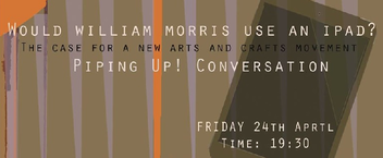 For those interested in the Arts and Crafts movement and the recent revival of interest in traditional crafts, this event should be really interesting. I'm a particular fan of Tom Hodgkinson, whose book - How to be Idle, I read some years ago whilst being very idle indeed on a beach in the Maldives!
Would William Morris use an iPad? 24 April at 7.30 pm The Conservatoire, Blackheath The Arts and Crafts movement was a response from William Morris and others on the edge of the Pre-Raphaelite movement against the rise of manufacturing, which they felt was soulless, lacked aesthetic and trapped people in poverty. They venerated artisan and traditional techniques, a simpler rural life and were social revolutionaries. In the wake of recession, the rise of digital technology and 24/7 marketing, modern communities are reacting by forming farmer's markets and hosting kitting bees, while 'low' lifestyle books are flying off the shelves. Are we seeing the beginnings of a new arts and crafts movement, and if so what does that look like in the age of the iPad? The three speakers will be: Tom Hodgkinson, editor of The Idler website and contributor to The Sunday Telegraph, The Guardian and The Sunday Times. Jan Marsh is current President of The William Morris Society and a biographer and curator, and a trustee of the William Morris Gallery in Walthamstow. Jane Burton, former Head of Content and Creative Director, Tate Media and now at Christies! This is a free event, Reserve tickets here. |
Ben Laughton SmithContemporary works of art in the classical tradition. Archives
March 2021
Categories |

 RSS Feed