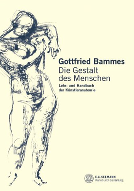
 For anyone interested in figure drawing, Gottfried Bammes is an excellent author and there are a couple of his books available in English. However, these books contain only selected highlights from his more detailed work, Die Gestalt des Menschen, which is only available in German (and at rather a high price).
Fortunately, there is an online resource which contains all of the various drawings from this larger work, without the text (which is useless to me anyway since I don't speak German!) I'd highly recommend it to anyone looking for a way of simplifying and understanding the key structures of the human form. I have a copy printed out, which I keep in my studio. It is probably the resource on anatomy that I refer to more than any other. You can access the images from Die Gestalt des Menschen here.
0 Comments
 It's been some weeks since I last posted anything and I fear it's rather too late to blame the Christmas period. After all, Easter eggs have been in the shops now since roughly one second past midnight on January 1st. Well, I'm not that quick to jump on a festive bandwagon, but with Shrove Tuesday shortly upon us, I feel only slightly premature in posting a chocolate-themed entry.
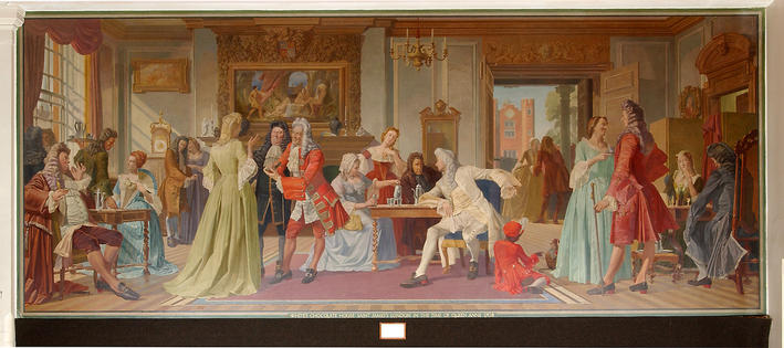
This painting, which originally hung in the Director's dining room at the Cadbury chocolate factory, Bournville, was painted by my grandfather, Robert Ball and a friend of his. At over 15 feet long and at least six high, the picture is enormous! I was lucky enough to see it a few years ago on a visit to the Cadbury corporate HQ, where it still hangs. The picture shows an imagined scene in White's Chocolate House, St James. White's was founded in Mayfair in 1693 by an Italian, Francesco Bianco. It became notorious for gambling and lives on today as an exclusive gentleman's club. I love the imagination with which the scene has been conceived. There are the lady and gentlemen playing chess, the lady perhaps feigning simplemindedness to ensnare her opponent, the men of business discussing important affairs while the old woman is more interested in the hot chocolate. Then there are the couple on the balcony, perhaps having having a tiff, and the two older gentlemen flirting with the young woman in the foreground – watched intently by the two gossips beside the fireplace. 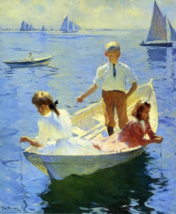 Frank Weston Benson (1862 – 1951) was an American artist from Salem, Massachusetts. Benson was known for his portraits, landscapes, watercolors and etchings. His advice to aspiring artists is available online here and is really worth a read. His thoughts here contain has many insights which are relevant to those studying in modern ateliers today or are following a broadly classical programme of self-study.
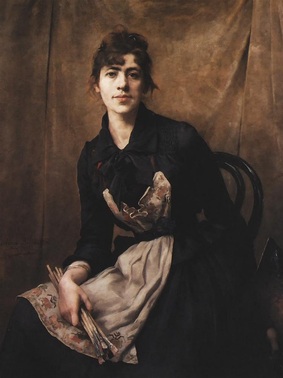 Bilińska-Bohdanowicz This self-portrait by Anna Bilińska-Bohdanowicz was painted in 1887. I love her soft, brushy paint application and the subdued, but not sombre, use of colour. The way she has caught her posture is very pleasing, situating her somewhere between repose and imminent action. Born in 1857 in Warsaw, Bilińska travelled to Paris studying at the Académie Julian and participated in the Paris Salons many times. Bilińska interests me because of the insight she manages to convey in her portraits and also, from a technical perspective, because a number of her painting are not highly finished, which gives a window onto her working technique. I enjoy how personal and sincere her paintings are and the contemplative atmosphere that they often have. 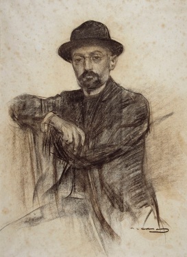 Ramon Casas Catalan artist Ramon Casas was particularly known as a portraitist, but he was also an accomplished graphic designer and contributed to the development of modernisme in Barcelona and the wider Catalan region. Casas's painted portraits are very different from Bilińska's. They are brighter, more joyful and his painting somehow has more self-confidence. I find they lack some of the psychology and depth of Bilińska work. Casas studied for a short time with Carolus-Duran in Paris. In addition to portraits, he painted crowd scenes ranging from the audience at a bullfight, to the assembly for an execution to rioters in the Barcelona streets. Casas enjoyed considerable international prominence during his own lifetime. 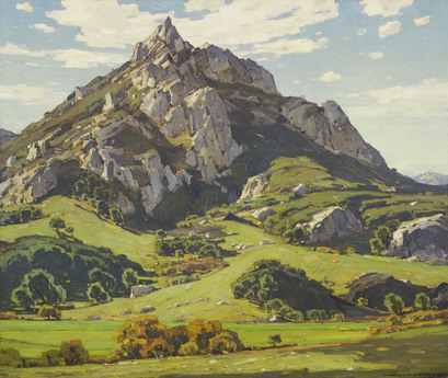 William Wendt
I love this painting by American landscape painter William Wendt. Like all of his paintings, his use of colour here is so striking and luscious. The freshness of his handling, combined with that amazing colour gives an impression of the scene so vibrant that I almost feel I can breathe the air and feel the breeze on my face. Born in 1865, Wendt was based in California and most of his paintings were mountain scenes, like this one. These often remind me of the views is the English Lake District, which I have great fondness for.
I was just looking at the Rosemary & Co Facebook page and found a link to this video on brush maintenance - which I thought I'd share on here.
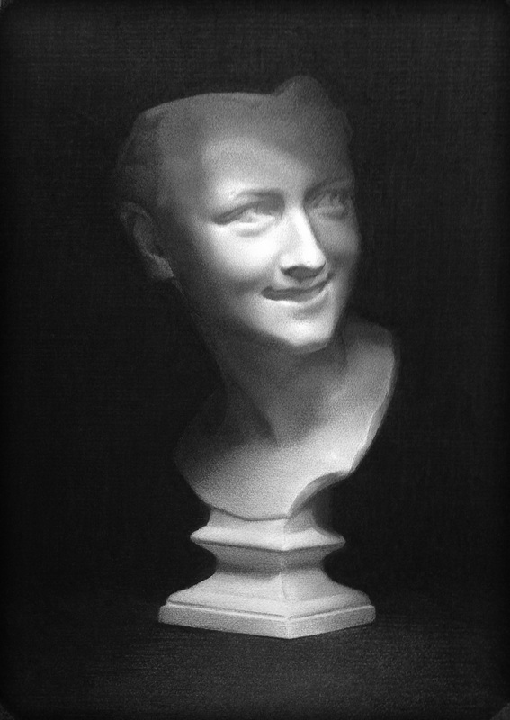
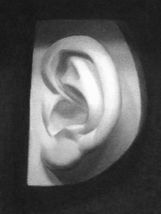 I recently completed this cast drawing, my second since starting full time at LARA. The drawing is done in Nitram charcoal on Fabriano Roma paper. The subject posed some interesting problems. Not only was it a challenge to get the internal information correctly laid out - the outside of the cast itself also had peculiarly difficult dimensions to capture.
The exercise of producing the drawing was made easier by conceptualising and naming the different abstract shapes that make the the overall impression (I managed to find a cat, a swan, a scimitar, a fish and a kiwi). This really helped in understanding the gesture of the individual folds of the ear, enabling me to arrange the various masses accurately. Getting the correct values was the second big challenge. It is relatively easy to get two adjacent values in the correct relationship, but much more difficult to juggle the whole light impression so that the drawing accurately matches nature. In this instance, along with the smaller planes there were two distinct larger planes of the ear (the upper part tipping towards the viewer from the top to the middle, the lower part tipping away from the middle to the bottom). This took quite a while to get right. Overall I'm really pleased with the drawing - particularly the handling of the shapes. The finish is not quite as refined as I'd like, though - and the drawing doesn't seem to 'pop' out of the page to the extent I was hoping for. Something to aim for in my next one, which I kicked off a couple of days ago. 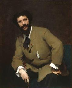 Born in 1847, painter and art critic Robert Alan Mowbray Stevenson (a cousin of Robert Louis Stevenson) In 1873 Stevenson studied at the Ecole des Beaux-Arts then under Carolus Duran (pictured left). He wrote the classic book Velasquez in which he discussed the nature of the purely pictorial appeal of the painter's art. The final chapter of the book, in particular, has some fascinating insights into the philosophy of seeing which is at the core of much modern representational painting.
These excerpts give an indication of Stevenson's conception of the importance of the visual impression in Velasquez's work - his views having been informed during his time studying with Duran: "The modern painter should concern himself very much about what seems and scarcely at all about what is." "Twigs, stones, slates, grass, leaves, can only be suggested; an attempt to define them really could result in nothing but a coarse travesty, which must inevitably lessen the effect of the more important markings." "Those who have not been taught from the beginning in an impressionistic school must remember difficulties which beset them when they were working from nature, and will recall how they only began to appreciate the meaning and the necessity of working from a single impression. How often it seemed impossible to finish a picture. The more closely they applied themselves to study and complete a part, the more it seemed to change to their eyes, and to invalidate their previous observations... Now, all of his separate observations may have been true, but they were all made under different conditions of attention to the scene; whereas, until every part of the picture has been observed in subservience to the impression of the whole, completeness can never be even begun." "A shadow on the yellow sand will alternately seem cold or warm, blue or orange, according to the concentration or diffusion of the sight...When a shadow is looked at alone it appears more full of colours than when the surrounding sunlit parts of the view are taken in and are allowed to operate on the shadow." |
Ben Laughton SmithContemporary works of art in the classical tradition. Archives
March 2021
Categories |
 RSS Feed